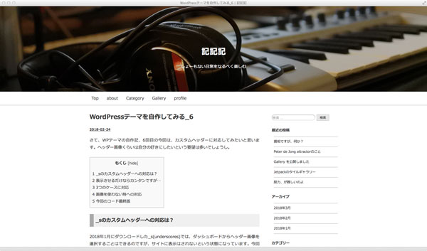
テーマ自作記の7回目ですが、ついにこの自作テーマのデザインに変更いたしましたので、スクショなしでも、現状どんな塩梅かおわかりいただけるかと存じまする。
ヘッダー全体を画像にしたい!
前回、カスタムヘッダーに対応したわけですが、画像をヘッダー全体に広げたくなってきちゃいまして、それだと前回のコードではダメだということで、やり直しとなりました(笑)。
前回は「.header-image」に直接「img」を読み込んだので、positionで「.site-branding」を重ねたわけですが、今回は画像を背景として読み込んで、それに「.site-branding」を重ねるという方法に変更しました。
<?php if ( get_header_image() ) : ?>
	<div class="header-image" style="background-image: url(<?php header_image(); ?>);">
	<div class="site-branding">
<?php else : ?>
	<div class="header-image">
	<div class="site-branding no-header-image">
<?php endif; ?>
ただそうしますと、前回のような
.header-image {
	img {
		display: block;
		margin: 0 auto;
	}
}
では全画面表示にできませんで、大変悩みましたが、『NxWorld』さんの記事を参考にさせていただき、ただ自分の環境ではそのままではうまくいかなかったので、
.header-image {
	width:100%;
	height: 0;
	padding-top: (400/2000*50%);
	padding-bottom: (400/2000*50%);
	background: center center / cover no-repeat;
}
てな具合になりました。
タイトルを天地左右中央揃えしたい!
さらに「.site-branding」を天地左右中央揃えにしたいなーと思っても、これまたうまくいかず、こちらの記事を参考に
.header-image {
	width:100%;
	height: 0;
	padding-top: (400/2000*50%);
	padding-bottom: (400/2000*50%);
	background: center center / cover no-repeat;
	display: flex;
	flex-direction: column;
	justify-content: center;
	align-items: center;
}
という具合になりましたが、天地はブラウザによってややアレです…。まあ、とりあえず現時点では個人サイト用なので、この辺にしておきます。